
Ui/Ux Design Wireframe Kit: Build Interfaces: A Complete UI/UX Wireframe Toolkit
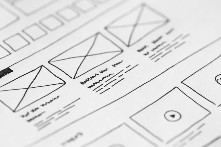
Designing a digital product that feels natural to its users begins long before any pixel is colored. Early‑stage sketches capture the core of an interaction, yet they often lack the precision required for collaborative development. A well‑structured wireframe toolkit fills that gap. It provides designers with a library of reusable elements that articulate layout, hierarchy, and behavior without the distraction of visual branding. The following guide explains how to assemble, adapt, and apply such a toolkit so that teams can move from concept to functional prototype efficiently and with confidence.
Why a Wireframe Toolkit Is
When a project gets underway, every screen must adhere to a consistent set of conventions. Inconsistent button dimensions, uneven spacing, or divergent form‑field arrangements generate friction for both users and developers. A shared library of low‑fidelity components eliminates that friction by establishing a common visual language. The benefits are tangible:
- Reduced hand‑off friction: Developers receive clear, repeatable specifications, which cuts the number of clarification cycles.
- Faster iteration cycles: Designers can swap or adjust components without rebuilding each screen from scratch.
- Focused usability testing: Test participants evaluate flow and functionality rather than being distracted by color or imagery.
Beyond visual consistency, a toolkit also codifies interaction patterns. Hover states, focus outlines, and disabled appearances are defined once and reused across the entire prototype. This ensures that every element behaves predictably during usability testing and that the final product delivers a coherent experience.
Core Elements of a Wireframe Toolkit
The following checklist outlines the most frequently required components. Each item should be delivered as a vector shape or a symbol that can be duplicated without loss of quality.
- Buttons – Primary, secondary, and tertiary styles with clear states for default, hover, active, and disabled.
- Navigation bars – Horizontal and vertical variations, including logo placeholders, menu items, and responsive collapse icons.
- Form controls – Text fields, checkboxes, radio buttons, toggle switches, and dropdowns, each with label and error‑state variations.
- Cards – Containers for images, titles, body text, and call‑to‑action links, supporting both grid and list layouts.
- Modals and dialogs – Overlay structures with header, content area, and action buttons.
- Typography placeholders – Heading, subheading, paragraph, and caption styles that illustrate hierarchy without specifying fonts.
- Iconography – Common action icons (search, edit, delete, download) presented as simple outlines.
- Grids and spacing guides – Column systems, gutter widths, and margin presets that enforce alignment.
- Feedback elements – Toasts, alerts, and loading spinners that communicate system status.
Building the Toolkit From Scratch
Creating a library involves three distinct phases: audit, definition, and construction.
1. Conduct an Audit of Existing Assets
Gather every UI element currently in use across projects—both finished products and work‑in‑progress sketches. Categorise them by function (e.g., navigation, input, feedback) and note any variations in size, spacing, or interaction. This inventory reveals redundancies and highlights gaps that the new toolkit must address.
2. Define a Consistent Design Language
Establish a set of rules that governs the visual vocabulary of the toolkit. Typical parameters include:
- Base grid: 8‑pixel increments for margins, paddings, and line heights.
- Corner radius: a single value (e.g., 4 px) applied to all interactive components.
- Stroke weight: uniform line thickness for icons and outlines.
- State conventions: colour‑agnostic shading or pattern changes to indicate hover, focus, and disabled states.
Document these rules in a short style guide that lives alongside the component library. The guide becomes the reference point for anyone adding or modifying assets.
3. Construct the Library in a Design Tool
Choose a vector‑based design application that supports symbols or components (e.g., Figma, Sketch, Adobe XD). Follow these best‑practice steps:
- Create a dedicated file named “Wireframe Toolkit”.
- Set up a master page that contains the grid, spacing guides, and the style‑guide reference.
- Build each component as a symbol, ensuring that every state (default, hover, active, disabled) is represented within the same master.
- Use auto‑layout features where available to allow components to resize fluidly while preserving spacing rules.
- Publish the file to a shared team library, granting read‑only access to developers and stakeholders.
Integrating the Toolkit Into the Design Workflow
Once the library is live, embed it into everyday processes to maximise its impact.
Design Phase
Begin each new project by pulling the required components from the shared library rather than recreating them. This habit reduces the cognitive load on designers and guarantees that every screen starts from a vetted baseline.
Review Phase
During design critiques, reference the style guide to validate that components adhere to the established rules. Encourage reviewers to flag any deviation, however minor, so that inconsistencies are corrected before development hand‑off.
Development Hand‑off
Export the wireframe file as a read‑only prototype or generate a specification sheet that lists component dimensions, interaction states, and responsive breakpoints. Because the library already defines these attributes, developers can translate the design into code with minimal ambiguity.
Maintaining the Toolkit Over Time
A living library requires regular stewardship. Assign a “design system owner”—typically a senior designer or design‑ops specialist—who is responsible for:
- Reviewing incoming feature requests for new components.
- Updating existing symbols when the design language evolves.
- Version‑controlling the library to preserve historical references.
- Communicating changes to the broader team through release notes or short walkthrough videos.
Schedule quarterly audits to prune unused assets and to ensure that the toolkit remains lean and purposeful.
Tool Recommendations
While any vector‑based application can host a wireframe toolkit, the following platforms are particularly well‑suited for collaborative environments:
| Tool | Key Strength | Collaboration Feature |
|---|---|---|
| Figma | Real‑time multi‑user editing | Shared libraries with granular permission controls |
| Sketch | symbol system | Cloud workspaces for team libraries |
| Adobe XD | Integrated prototyping | Coediting via Creative Cloud |
Choose the solution that aligns with your organization’s existing workflow and licensing model.
Case Study: Reducing Cycle Time for a SaaS Dashboard
A mid‑size software‑as‑a‑service company struggled with prolonged design‑to‑development cycles. Each new dashboard screen required designers to recreate button sets, form fields, and navigation bars from scratch, resulting in an average of eight revision rounds per feature.
After conducting an asset audit, the team built a wireframe toolkit containing 42 symbols covering all interaction patterns used across the product. Within two sprints, the average number of revision rounds fell from eight to three, and the overall time‑to‑market for new features improved by 27 %.
Key takeaways from the initiative include:
- Investing early in a shared library yields measurable efficiency gains.
- Documenting interaction states prevents ambiguous hand‑offs.
- Ongoing stewardship ensures the library scales with product complexity.
Best‑Practice Checklist
- Audit existing UI assets before defining new components.
- Establish a concise set of design‑system rules (grid, radius, stroke).
- Create each element as a reusable symbol with all interaction states.
- Publish the library to a shared workspace and restrict editing rights.
- Integrate the toolkit at the start of every design project.
- Use the style guide as the reference during reviews and hand‑offs.
- Assign a dedicated owner to maintain version control and updates.
- Schedule regular audits to keep the library lean.
Conclusion
A thoughtfully assembled wireframe toolkit becomes the backbone of a disciplined design process. By providing a consistent set of low‑fidelity components, it removes visual noise, accelerates iteration, and creates a common language between designers and developers. Investing time in audit, definition, and maintenance pays dividends in reduced revision cycles, clearer communication, and ultimately, products that meet user expectations more effectively. Teams that embed such a toolkit into their workflow position themselves to deliver high‑quality digital experiences with confidence and speed.
 UI/UX Design Wireframe Kit" loading="lazy" style="max-width:100%;height:auto;border-radius:8px;">

Frequently Asked Questions About Ui/Ux Design Wireframe Kit
What is Ui/Ux Design Wireframe Kit?
Ui/Ux Design Wireframe Kit is best understood as a practical, results-focused subject. Start with the fundamentals covered , apply them consistently, and measure your progress with real data over time.
How do beginners get started with Ui/Ux Design Wireframe Kit?
Beginners should focus on one clear goal, follow a proven step-by-step routine, avoid the common beginner mistakes listed above, and build a simple daily or weekly habit around ui/ux design wireframe kit.
What results can you realistically expect?
With consistent effort, most people see early progress within a few weeks. The key is choosing the right strategy, tracking what actually works, and improving steadily instead of chasing quick fixes.
Comments
Post a Comment